Extension:Semantic Forms Inputs
 Release status: stable |
|||
|---|---|---|---|
| Implementation | User interface | ||
| Description | Provides additional input types for Semantic Forms | ||
| Author(s) | Stephan Gambke, with contributions from Yaron Koren, Jeroen De Dauw, Sanyam Goyal, Yury Katkov and others | ||
| Latest version | 0.7 (May 2013) | ||
| MediaWiki | 1.17+ | ||
| PHP | 5+ | ||
| Database changes | No | ||
| License | GPL 2.0 or higher | ||
| Download | Semantic Forms Inputs 0.7 | ||
|
|||
|
Translate the Semantic Forms Inputs extension if possible |
|||
| Check usage and version matrix; code metrics | |||
| Bugs: list open list all report | |||
Contents
Description[edit | edit source]
Semantic Forms Inputs is an extension to MediaWiki that provides additional input types for Semantic MediaWikis that use the Semantic Forms extension.
The Semantic Forms extension allows users to add, edit and query data of a Semantic MediaWiki using forms. For every form field the input type specifies the type of input a field will have in the form. Semantic Forms comes with basic input types for all data types. This extension -- Semantic Forms Inputs -- aims to collect further, optically and/or functionally enhanced input types.
Installation[edit | edit source]
Note: Having MediaWiki (version 1.17 or higher), Semantic MediaWiki (version 1.5.4 or higher) and Semantic Forms (2.4.2 or higher) installed is a precondition for the Semantic Forms Inputs extension; the code will not work without them. Lower versions might work but are not tested.
Note: If you upgrade from a version before 0.4, be aware that for the date picker the format of several parameters has changed!
- Download a released version or the current development version
- Alternatively you can clone Semantic Forms Inputs using git
- Extract the files to the
$IP/extensionsdirectory - If necessary rename the newly created directory to SemanticFormsInputs
- Add to the end of LocalSettings.php:
require_once("$IP/extensions/SemanticFormsInputs/SemanticFormsInputs.php");
- Do some customization if necessary (see below)
- Go to the Special:Version page of your wiki and verify that an entry for Semantic Forms Inputs exists
Documentation for the development version can be found at Extension:Semantic_Forms_Inputs/alpha
There is a version history available.
Customization[edit | edit source]
You can change the settings of the Semantic Forms Inputs extension by placing new settings in your LocalSettings.php file, below the inclusion of SemanticFormsInputs.php.
You can find all the default settings and their descriptions in the file SFI_Settings.php.
Date picker[edit | edit source]
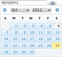
Input type: datepicker
The date picker lets a user pop up a graphical calendar and choose a date from it. The calendar is generated entirely via script and can be navigated without any page refreshes. It always returns dates in the format yyyy/mm/dd, so they can directly be used as property values. You can tweak the appearance of the calendar by changing or overriding the CSS rules of the jQuery library.
The datepicker is somewhat peculiar in that the first day of the week is not set in a configuration variable, but in an internationalized message. This way most wikis should automatically get the right setting depending on the language. If you want to change the default first day of week, instead of changing a configuration variable you need to edit the page MediaWiki:Semanticformsinputs-firstdayofweek in your wiki.
Examples[edit | edit source]
Example: A field that uses a date picker with all parameters set to their default values
{{{field|foo|input type=datepicker}}}
Example: A field that uses a date picker with specific parameters:
{{{field|foo|input type=datepicker
|disable input field
|show reset button
|show week numbers
|week start=1
|highlight days of week=0
|disable days of week=6,0
|disable dates=2011/05/01,2010/12/25-2011/01/06
|date format=dd.mm.yy}}}
Parameters[edit | edit source]
| Parameter | Support | Meaning/Remark |
|---|---|---|
| Standard | ||
| size | yes | Specifies the width of the text entry. |
| maxlength | yes | Specifies the maximum allowed length of the text entry. |
| rows | no | |
| cols | no | |
| mandatory | yes | |
| hidden | yes | |
| restricted | yes | |
| uploadable | no | |
| autocomplete | no | |
| no autocomplete | no | |
| autocomplete on category | no | |
| autocomplete on concept | no | |
| autocomplete on namespace | no | |
| remote autocompletion | no | |
| property | no | |
| default | yes | Format: yyyy/mm/dd |
| values | yes | The days must be given as comma-separated list of dates or date ranges. The format for days is yyyy/mm/dd, for date ranges use yyyy/mm/dd-yyyy/mm/dd. Spaces are permissable. |
| values from category | yes | see parameter values |
| values from concept | yes | see parameter values |
| list | no | |
| delimiter | no | |
| class | yes | |
| Type Specific | ||
| date format | The date format string. It is only used for the input field. The date sent back with the form is always of format yyyy/mm/dd, so it can easily be used as value for a property of type Date.
There are two predefined standard date formats available:
To build your own format use the following keys:
|
|
| week start | The first day of the week (0 - Sunday, 1 - Monday, ...) | |
| first date | the first date that can be chosen (in yyyy/mm/dd format) | |
| last date | the last date that can be chosen (in yyyy/mm/dd format) | |
| disable days of week | List of days that can not be selected (e.g. weekend: 6, 0) | |
| highlight days of week | List of days that shall appear highlighted (e.g. weekend: 6, 0) | |
| disable dates | comma-separated list of disabled dates/date ranges (dates in yyyy/mm/dd format, ranges in yyyy/mm/dd-yyyy/mm/dd format) | |
| highlight dates | comma-separated list of dates/date ranges that shall appear highlighted (dates in yyyy/mm/dd format, ranges in yyyy/mm/dd-yyyy/mm/dd format) | |
| show/hide week numbers | If week numbers shall be shown left of the week | |
| disable/enable input field | If the user shall be able to fill the input field directly or only via the date picker. | |
| show/hide reset button | If a reset button shall be shown. This is the only way for the user to erase the input field if it is disabled for direct input. | |
Time picker[edit | edit source]
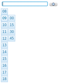
Input type: timepicker
The time picker lets a user pop up a menu of hours and minutes and choose a time from it. You can tweak the appearance of the time picker by changing or overriding the CSS rules of the jQuery library and/or the SFI time picker stylesheet.
Examples[edit | edit source]
Example: A field that uses a time picker with all parameters set to their default values
{{{field|foo|input type=timepicker}}}
Example: A field that uses a time picker with specific parameters:
{{{field|foo|input type=timepicker
|disable input field
|show reset button
|mintime=07:00
|maxtime=16:59
|interval=10
}}}
Parameters[edit | edit source]
| Parameter | Support | Meaning/Remark |
|---|---|---|
| Standard | ||
| size | yes | Specifies the width of the text entry. |
| maxlength | yes | Specifies the maximum allowed length of the text entry. |
| rows | no | |
| cols | no | |
| mandatory | yes | |
| hidden | yes | |
| restricted | yes | |
| uploadable | no | |
| autocomplete | no | |
| no autocomplete | no | |
| autocomplete on category | no | |
| autocomplete on concept | no | |
| autocomplete on namespace | no | |
| remote autocompletion | no | |
| property | no | |
| default | yes | Format: hh:mm |
| values | no | |
| values from category | no | |
| values from concept | no | |
| list | no | |
| delimiter | no | |
| class | yes | |
| Type Specific | ||
| mintime | The earliest time to show. Format: hh:mm | |
| maxtime | The latest time to show. Format: hh:mm | |
| interval | Interval between minutes. Number between 1 and 60. | |
| disable/enable input field | If the user shall be able to fill the input field directly or only via the date picker. | |
| show/hide reset button | If a reset button shall be shown. This is the only way for the user to erase the input field if it is disabled for direct input. | |
DateTime picker[edit | edit source]
Input type: datetimepicker
The datetime picker is a combination of the Date picker and the Time picker. It presents the datepicker and timepicker inputs side by side and returns one combined value in the format "yyyy/mm/dd hh:mm".
Examples[edit | edit source]
Example: A field that uses a datetime picker with all parameters set to their default values
{{{field|foo|input type=datetimepicker}}}
Example: A field that uses a datetime picker with specific parameters:
{{{field|foo|input type=datetimepicker
|disable input field
|show reset button
|week start=1
|highlight days of week=0
|disable days of week=6,0
|disable dates=2011/05/01,2010/12/25-2011/01/06
|mintime=07:00
|maxtime=16:59
|interval=10
}}}
Parameters[edit | edit source]
The parameters are the same as for the component inputs, i.e. for datepicker and timepicker combined. Exceptions are given below:
| Parameter | Support | Meaning/Remark |
|---|---|---|
| size | yes | Specifies the width of each entry. No way to set it separately. |
| maxlength | yes | Specifies the maximum allowed length of each entry. No way to set it separately. |
| default | yes | Format: yyyy/mm/dd hh:mm |
| values | yes | Only the date portion will be used. The time portion will be ignored. |
| values from category | yes | Only the date portion will be used. The time portion will be ignored. |
| values from concept | yes | Only the date portion will be used. The time portion will be ignored. |
Menuselect[edit | edit source]
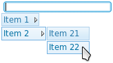
Input type: menuselect
The menuselect input type lets a user pop up a menu with submenus and choose an entry from it. To use the menuselect you have to pass the menu structure as an unordered list. If you use wiki-internal links, the link text will be shown in the menu while the name of the target article will be sent back to the form. This currently only works in the development version on Git.
This input type is intended to display menus of modest dimensions. It is not intended for monsters with hundreds of entries in dozens of submenus. You have been warned.
You can tweak the appearance of the menuselect by changing or overriding the CSS rules of the jQuery library and/or the SFI menuselect stylesheet.
If you need to use the pipe symbol (|) in the structure, you have to replace it by {{!}}.
Examples[edit | edit source]
Example: A field that uses a menuselect with all parameters set to their default values
{{{field|foo|input type=menuselect
|structure=
* Item 1
** Item 11
** Item 12
* Item 2
** Item 21
** Item 22
}}}
Example: A field that generates the menu structure from semantic data. You need Extension:SemanticResultFormats version 1.9 or later for this to work.
{{{field|Part of|input type=menuselect|structure= {{#ask: [[Part of::+]]{{!}} format=tree{{!}} parent=Part of }} }}}
Parameters[edit | edit source]
| Parameter | Support | Meaning/Remark |
|---|---|---|
| Standard | ||
| size | yes | Specifies the width of the text entry. |
| maxlength | yes | Specifies the maximum allowed length of the text entry. |
| rows | no | |
| cols | no | |
| mandatory | yes | |
| hidden | yes | |
| restricted | yes | |
| uploadable | no | |
| autocomplete | no | |
| no autocomplete | no | |
| autocomplete on category | no | |
| autocomplete on concept | no | |
| autocomplete on namespace | no | |
| remote autocompletion | no | |
| property | no | |
| default | yes | |
| values | no | |
| values from category | no | |
| values from concept | no | |
| list | no | |
| delimiter | no | |
| class | yes | (for the input field only) |
| Type Specific | ||
| structure | The menu structure as an unordered list | |
| disable/enable input field | If the user shall be able to fill the input field directly or only via the menu. | |
Two Listboxes[edit | edit source]
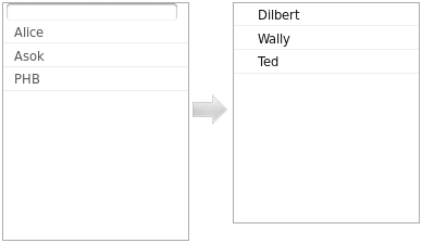
Input type: two listboxes
The twolistboxes input is very much like a listbox input from Semantic Forms. Use it if you need to add a list of predefined values to the field. The left listbox contains the possible values. If you click on one of the values it will move to a right listbox and will be considered as selected.
Use this input in conjunction with parameters values, values from category, values from concept, values from property, values from query.
Examples[edit | edit source]
Example:
{{{field|Employees|input type=two listboxes|values=Dilbert,Alice,Asok,Boss,PHB,Wally}}}
Example:
Parameters[edit | edit source]
| Parameter | Support | Meaning/Remark |
|---|---|---|
| Standard | ||
| size | yes | |
| maxlength | yes | |
| rows | no | |
| cols | no | |
| mandatory | yes | |
| hidden | yes | |
| restricted | yes | |
| uploadable | no | |
| autocomplete | no | |
| no autocomplete | no | |
| autocomplete on category | no | |
| autocomplete on concept | no | |
| autocomplete on namespace | no | |
| remote autocompletion | no | |
| property | no | |
| default | yes | |
| values | yes | |
| values from category | yes | |
| values from concept | yes | |
| list | no | |
| delimiter | no | |
| class | yes | |
| Type Specific | ||
| someparam | ||
Date Check[edit | edit source]
Input type: datecheck
The datecheck input is new in version 0.8. It checks if the inserted date has the right Format.
we use this JQuery Plugin: http://formvalidator.net/#default-validators_dates
Examples[edit | edit source]
Example:
{{{field|Date|input type=datecheck|date format=YYYY/MM}}}
Parameters[edit | edit source]
| Parameter | Support | Meaning/Remark |
|---|---|---|
| Standard | ||
| size | no | |
| maxlength | no | |
| rows | no | |
| cols | no | |
| mandatory | yes | |
| hidden | no | |
| restricted | yes | |
| uploadable | no | |
| autocomplete | no | |
| no autocomplete | no | |
| autocomplete on category | no | |
| autocomplete on concept | no | |
| autocomplete on namespace | no | |
| remote autocompletion | no | |
| property | no | |
| default | no | |
| values | no | |
| values from category | no | |
| values from concept | no | |
| list | no | |
| delimiter | no | |
| class | no | |
| Type Specific | ||
| date format | dd/mm/yyyy | |
Regular expression filter[edit | edit source]
Input type: regexp
What it does: With the Regular Expression Filter you can fine-tune what values are allowed and what is blocked in your input fields. You can even string several filters together to have a cascade of checks, e.g. to give an error message specific to what violation occurred.
How it works: Specify regexp as your input type and in the parameter regexp give a Javascript regular expression, that the user input has to match. If you want a base type different from text specify it with the parameter base type. You may want to specify an error message with the message parameter. Finally there is the problem, that you can not use the | character because it gets lost in the field definition. Use ! instead. Or specifiy any other replacement character in the parameter or char and use that. See Regular Expressions for an introduction to writing a regular expression pattern in Javascript.
If you want to specify a chain of regexp filters there is the problem, that every parameter can be used only once in every field definition, e.g. just giving regexp twice will not work. To work around that and still be able to address the filters further down the chain, specify a prefix for each filter in the parameter base prefix of its predecessor. Sounds complicated? Have a look at the example below. You may, but do not need to specify a prefix for the final input type - each filter stage consumes only the parameters from the parameter set, that it understands, i.e. the specific parameters listed below.
Examples[edit | edit source]
Example: A simple text input field accepting only letters, numbers and spaces. (This may be useful for fields from which an article's name is generated in the Semantic Forms one-step process.)
{{{field|foo|input type=regexp|regexp=/^[0-9A-Za-z ]+$/}}}
Example: A text input field accepting only numbers and having no more than 5 digits. Certain numbers are forbidden. Each condition gets its own error message.
{{{field|foo|input type=regexp
|regexp=/^\d*$/|message=Only numbers!|base type=regexp|base prefix=filter2
|filter2.regexp=/^.{0,5}$/|filter2.message=No more than 5 digits!|filter2.base type=regexp|filter2.base prefix=filter3
|filter3.regexp=/^666$/|filter3.message=Don't you dare!|filter3.inverse}}}
Parameters[edit | edit source]
| Parameter | Support | Meaning |
|---|---|---|
| Standard | ||
| Depends on the base type | ||
| Type Specific | ||
| base type | The base type to be used. May be any input type that generates an html form element of type input or select (e.g. text (with or without values), listbox, datepicker) or another regexp. Defaults to text. | |
| base prefix | Prefix for the parameters of the base type (see example) | |
| regexp | The regular expression the input has to match to be valid. This must be given including the slashes! Defaults to /.*/, i.e. any value. | |
| inverse | If set, the input must NOT match the regular expression to be valid. I.e. the regular expression is inverted. | |
| or char | The OR-character to be used in the regular expression instead of |. Defaults to ! | |
| message | The error message to be displayed if the match fails. Defaults to Wrong format! (or equivalent in the current locale) | |
Credits[edit | edit source]
SFI uses the jQuery and jQuery UI Javascript libraries for several input types.
Button icons for 'datepicker' and 'timepicker' (and 'datetimepicker') are derived from the Mini Icons 2 icon set from brandspankingnew.net. See the relevant article on brandspankingnew.net
Finally, internationalization was achieved through the work of the translatewiki community. See [1]
Contact[edit | edit source]
Bugs should preferably be reported on the Wikimedia bug tracker.
Comments, questions and suggestions should be sent or posted to:
- the Semantic Mediawiki User mailing list (preferred)
- the Semantic Forms Inputs discussion page
- the author